How to Choose the Right Color Temperature for Your Room: The Ultimate Home Lighting Guide
Part 1: The Science of Light: Understanding Color Temperature
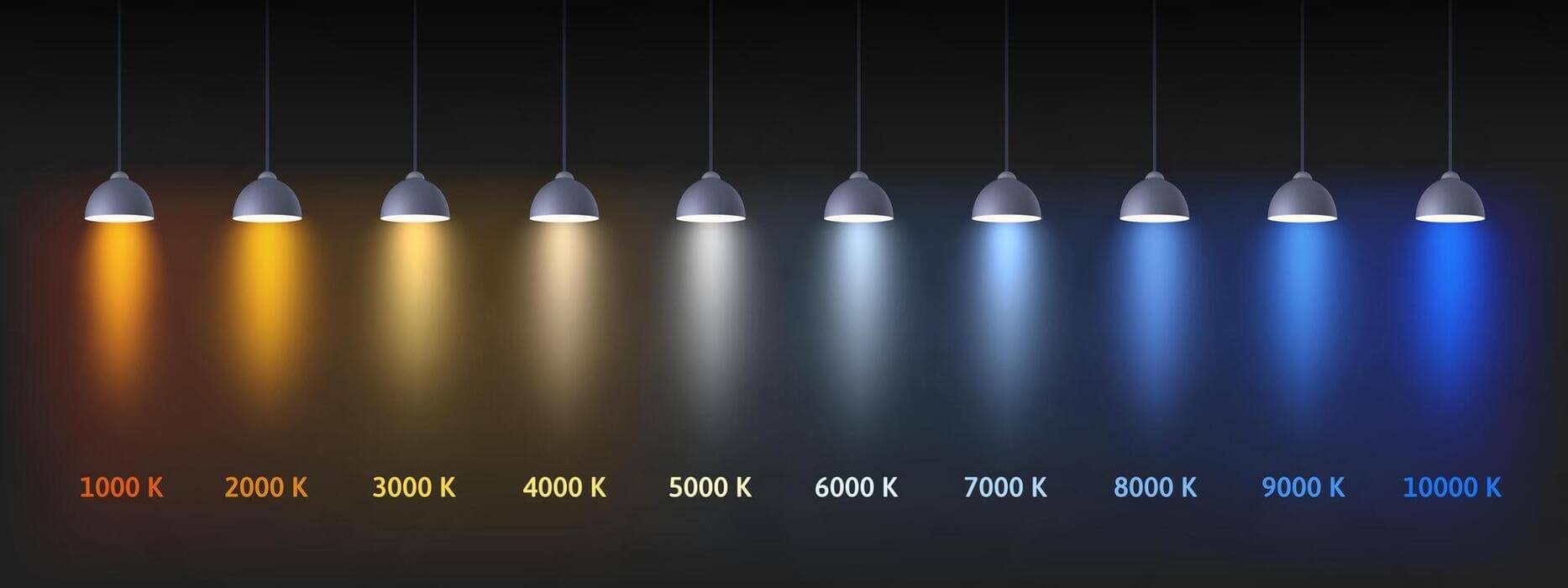
To master your home’s atmosphere, you must first understand the metric known as Correlated Color Temperature (CCT). While it sounds like a term reserved for physicists, it is simply a way to describe the color appearance of light emitted by a bulb. We measure this in degrees Kelvin (K).
The scale functions somewhat counterintuitively compared to a thermometer: lower numbers indicate “warm” colors (reds and yellows), while higher numbers represent “cool” colors (whites and blues). Imagine heating a block of steel; it glows red first, then yellow, then white, and finally blue-hot. That is the Kelvin scale in action.
1.1 Decoding the Kelvin Scale
For residential and commercial lighting, the spectrum is generally broken down into these primary categories:
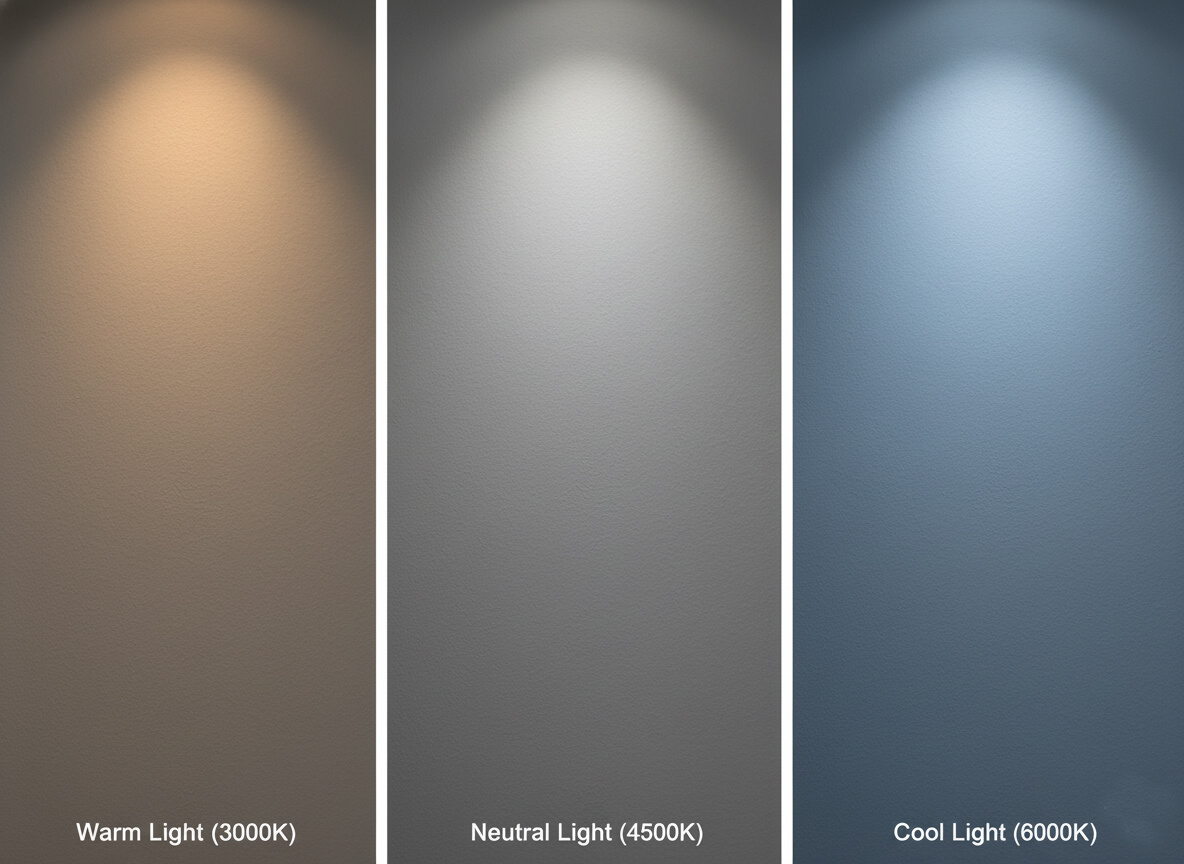
- Ultra Warm (1000K – 2000K): This is the atmospheric glow of candlelight, a sunset, or vintage Edison-style filament bulbs. It provides very little functional visibility but offers maximum mood enhancement.
- Warm White (2700K – 3000K): This is the industry standard for residential comfort. It replicates the familiar, yellow-tinged glow of traditional incandescent bulbs. It feels welcoming, intimate, and safe.
- Neutral or Cool White (3100K – 4500K): By removing the yellow undertones, this range offers a crisp, balanced white. It creates a sense of cleanliness and efficiency without being harsh.
- Daylight (4600K – 6500K): This light has a distinct blue cast, mimicking the high-contrast intensity of the sun at noon. It promotes alertness but can feel sterile if used incorrectly.
1.2 The Biology of Light: Circadian Rhythms and Mood
Light does not just allow us to see; it tells our bodies what time it is. Our biology is governed by circadian rhythms, an internal clock regulated by the color of light we are exposed to.
The Warmth of Sleep: As the sun sets, natural light shifts to warm, amber tones. This specific spectrum signals the brain to begin producing melatonin, the hormone required for sleep. Using warm lighting (2700K-3000K) in the evening supports this natural cycle. Research indicates that keeping evening light intensity low helps maintain healthy sleep patterns.
The Blue of Alertness: Conversely, the blue wavelengths found in cool white and daylight bulbs (4000K-5000K) act as a stimulant. They suppress melatonin and trigger the release of serotonin and cortisol. This chemical cocktail boosts focus, reaction times, and cognitive performance. This is why a “warm” office might make you feel drowsy, while a “cool” bedroom could lead to insomnia.
Part 2: Beyond Kelvin: Advanced Lighting Metrics
Have you ever purchased a shirt that looked green in the store but brown when you got it home? You were a victim of poor lighting quality. While Kelvin describes the color of the light, it does not tell you how well that light reveals the colors of objects. For that, we need to look deeper.
2.1 Lumens vs. Kelvin
It is crucial to distinguish between brightness and color. Lumens measure brightness, while Watts measure energy consumption. Kelvin measures color. However, perception plays a trick on us: a cool white bulb (4000K) will often appear “brighter” to the human eye than a warm white bulb (2700K) even if they both output the same 800 lumens. This is due to the higher contrast that blue light provides.
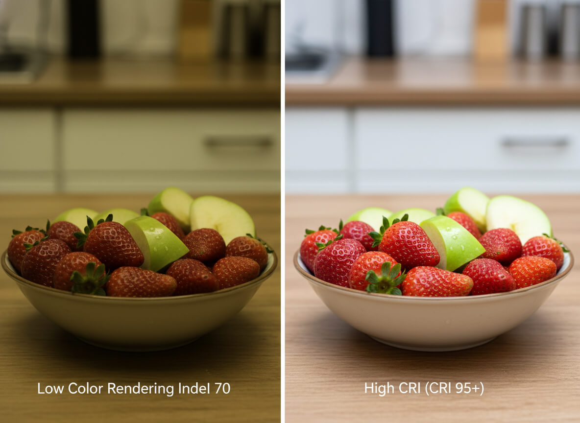
2.2 The Importance of CRI (Color Rendering Index)
The Color Rendering Index (CRI) is a score from 0 to 100 that rates a light source’s ability to reveal colors accurately compared to natural sunlight. Sunlight is the gold standard with a CRI of 100.
- Standard CRI (80): Acceptable for hallways and garages, but can make colors look slightly muddy.
- High CRI (90+): Essential for living spaces. It makes skin tones look healthy, food look appetizing, and art look vibrant.
The Secret Metric: R9: Standard CRI is calculated based on eight pastel colors. It often ignores saturated reds. The R9 value specifically measures how well a light renders red tones. This is critical because human skin tones and wood finishes contain a lot of red. A bulb can have a high CRI but a negative R9 value, resulting in people looking pale or sickly. Always look for lighting that specifies a high R9 value for the most natural appearance.
Part 3: Room-by-Room Guide: Residential Applications
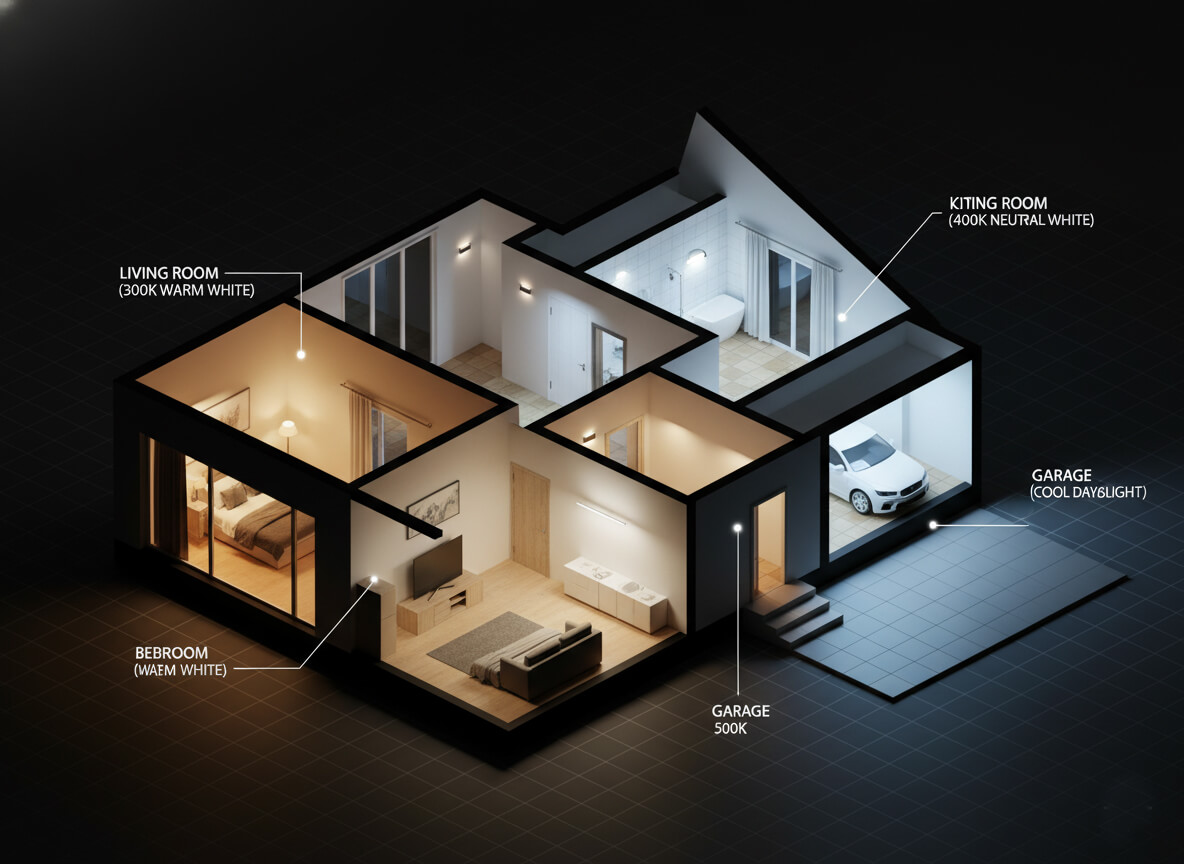
Lighting a home is an exercise in zoning. You shouldn’t aim for uniformity across the entire house; rather, you should tailor the light to the activity performed in each room.
3.1 The Living Room: Balancing Function and Comfort
This is the heart of the home, used for relaxation, socializing, and entertainment. The atmosphere should be inviting and stress-reducing.
- Ideal Range: 2200K – 3000K (Warm White).
- Decor Impact: Warm light enhances the rich tones of wood floors, brick fireplaces, and leather furniture. It creates a cozy “hearth” feel.
- Layering Strategy: Use a warm 2700K bulb for general overhead lighting. Add specific task lamps near reading chairs with a slightly cooler 3000K bulb to reduce eye strain without breaking the mood. Use ultra-warm 2200K accent strips for shelving or behind the TV to add depth.
3.2 The Kitchen: The Heart of the Home
The kitchen presents a unique challenge: it is a workspace that demands safety (handling knives, heat) but also a social gathering hub. The lighting must walk a fine line.
- Ideal Range: 3000K – 4000K (The “Sweet Spot”).
- The White Cabinet Problem: If you have a modern kitchen with white cabinets and marble counters, warm 2700K light can make the surfaces look yellow or dirty. A 4000K bulb will keep whites looking crisp. However, if your kitchen features traditional wood cabinetry, 3000K is better to bring out the grain.
- Task Lighting: Install under-cabinet lighting that is cooler (4000K). This puts high-contrast, functional light exactly where you chop and prep, while allowing the overhead lights to remain softer for dining.
3.3 The Bedroom: The Sanctuary for Sleep
The bedroom has one primary function: restoration. Lighting here should never compete with your body’s need to wind down.
- Ideal Range: 2200K – 2700K.
- Biological Imperative: Avoid cool white light at all costs in this space. Blue wavelengths suppress melatonin. Even if you read in bed, choose a dedicated reading light that is warm enough to prevent wakefulness.
- The Multifunctional Dilemma: If your bedroom contains a desk for remote work, do not rely on the overhead light for working. Use a task lamp with a 4000K bulb that can be switched off the moment the workday ends, signaling a mental transition to rest.
3.4 The Bathroom: Spa vs. Studio
Bathrooms suffer from split personalities. In the morning, they are precision studios for grooming. In the evening, they are spas for relaxation.
- Ideal Range: 3000K – 4000K.
- Vanity Lighting: This is critical. Use 4000K (Neutral White) with a high CRI. Warm light can mask blemishes and distort the color of makeup, leading to application errors that are only revealed in daylight.
- General/Tub Lighting: Use 2700K-3000K for the overhead or tub area. No one wants to take a relaxing bath under clinical interrogation lights.
3.5 The Home Office: Maximizing Productivity
In a workspace, comfort takes a backseat to cognitive performance. You need lighting that keeps your energy levels consistent.
- Ideal Range: 3500K – 5000K.
- Productivity Hack: A 4000K temperature is widely considered the best for focus. It boosts alertness without the harshness of 6500K, which can cause eye fatigue over long periods.
- Video Calls: For Zoom calls, a range of 3500K-4000K is generally the most flattering. It avoids the ghostly pallor of daylight bulbs and the orange cast of warm bulbs.
3.6 The Dining Room: Atmosphere and Appetite
Did you know lighting affects how food tastes? Or at least, how appetizing it looks?
- Ideal Range: 2400K – 3000K.
- Psychology: Warm light increases the color saturation of warm-toned foods (breads, roasts, sauces), making them look delicious. It also flatters the skin tones of your guests.
- Flexibility: This is the room where dimmers are non-negotiable. You need bright light for homework or puzzles in the afternoon, but a low, candle-like glow for dinner parties.
Summary Table: Room Recommendations
| Room | Recommended Kelvin | Primary Goal |
|---|---|---|
| Living Room | 2200K – 3000K | Relaxation & Socializing |
| Kitchen | 3000K – 4000K | Cleanliness & Safety |
| Bedroom | 2200K – 2700K | Sleep Hygiene |
| Bathroom (Vanity) | 4000K | Precision & Grooming |
| Home Office | 3500K – 5000K | Focus & Productivity |
| Dining Room | 2400K – 3000K | Ambiance & Appetite |
Part 4: Commercial and Industrial Applications

When we move from the home to the business world, the priorities shift from comfort to performance, safety, and sales psychology.
4.1 Office Buildings and Workspaces
Standard office lighting has settled on 4000K (Cool White). This temperature strikes a balance between keeping employees awake and preventing the headaches associated with harsh blue light. A critical specification for modern offices is UGR <19 (Unified Glare Rating). LED panels with this rating prevent glare on computer screens, significantly reducing eye strain and boosting overall productivity.
4.2 Retail and Hospitality
In this sector, lighting is a sales tool. Restaurants often utilize very warm light (2200K-3000K) to encourage diners to relax, linger longer, and order dessert. Retail stores vary by product: a denim store might use cool light to show the true indigo dye, while a bakery uses warm light to make pastries look golden. Supermarkets favor 5000K to convey a subconscious message of hygiene, freshness, and cleanliness.
4.3 Warehouses and Garages
In industrial settings, shadows are a safety hazard. 5000K to 6500K is standard. This high-contrast light ensures workers can read labels clearly, operate machinery safely, and see down long aisles. High efficacy and uniform distribution are key to eliminating dangerous dark spots.
Part 5: Factors Influencing Your Choice
While the guidelines above are a solid starting point, every space is unique. Several variable factors should influence your final decision.
5.1 Interior Design and Color Palette
Light interacts with the colors in your room in profound ways. If your home features a cool color palette (greys, blacks, blues, crisp whites), warm lighting can clash, making the space look dingy. These interiors often benefit from 3500K-4000K light. Conversely, homes with warm palettes (earth tones, wood floors, brick, tan, red) look vibrant under 2700K light. Putting cool light on red brick can make it look grey and lifeless.
5.2 Time of Use
Consider when the room is occupied. If a living room is used mostly in the evenings for winding down, lean warmer (2700K) to mimic the sunset. If a studio or workspace is used heavily during the day, a neutral white (4000K) will blend seamlessly with the natural daylight coming in through the windows, creating a consistent experience.
5.3 Location and Region
Geography plays a surprising role in lighting preferences. In cooler climates (like Northern Europe or the Northern US), people tend to prefer warmer indoor lighting to create a sense of psychological heat and coziness. In hotter, tropical climates, there is often a cultural preference for cooler, whiter light, which creates a psychological feeling of a cooler, airier space.
Part 6: Achieving Flexibility: The Best of Both Worlds
What if you use your dining table for work during the day and dinner at night? You shouldn’t have to compromise. Modern technology allows you to have it all.
6.1 The “Warm Dim” Technology
Traditional LEDs maintain their color temperature as they dim, meaning a dimmed 3000K bulb just looks like a grey 3000K bulb. “Warm Dim” technology mimics the behavior of incandescent filaments. As you lower the brightness, the color temperature shifts from 3000K down to a candle-like 1800K. This is the ultimate solution for hospitality and residential dining.
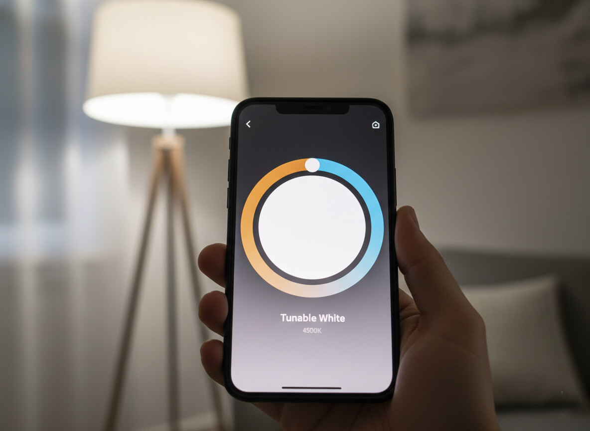
6.2 Tunable White and Smart Lighting
Smart bulbs (like Philips Hue or other ecosystems) allow you to utilize “Tunable White.” You can program these lights to automatically adjust throughout the day—pumping out energizing cool white in the morning to wake you up, and transitioning to soothing warm white in the evening. This concept, known as Human-Centric Lighting, aligns your indoor environment with your biological needs.
6.3 Layering Different Temperatures
You can also achieve flexibility through simple design. Place cool white bulbs in your task lamps (desk lamps, under-cabinet lights) for work, and use warm white bulbs in your floor lamps and overhead fixtures for relaxation. By switching different circuits on and off, you change the mood of the room instantly without fancy technology.
Part 7: Common Mistakes to Avoid
Even with good intentions, it is easy to go wrong. Here are the most frequent errors we see:
- The Hospital Effect: Using 5000K+ bulbs in residential living areas. Unless you are in the garage, this usually feels too harsh.
- The Dirty Kitchen: Using 2700K bulbs in an all-white kitchen. This often makes expensive white cabinets look yellowed or stained.
- The Checkerboard: Mixing 3000K and 5000K bulbs in the same recessed ceiling fixture. This creates inconsistent hotspots on the floor and looks unprofessional.
- Watts vs. Lumens: Buying based on Watts rather than Lumens and Kelvin. This often leads to buying a bulb that is the wrong color and wrong brightness.
- Ignoring CRI: Buying the cheapest LED bulk pack available often results in low CRI lighting, making your beautiful home decor look muddy and dull.
Frequently Asked Questions
1. Which light is better for eyes: warm or cool?For short durations and relaxation, warm light is easier on the eyes. However, for detailed tasks and reading, cool white (4000K) is actually better because it increases contrast, reducing the strain required to focus. The key is to avoid 6500K+ for long periods, which can cause fatigue.
2. Can I use 4000K lighting in my living room?You can, especially if you have a very modern, minimalist design style with cool colors (grey, black, blue). However, for most traditional homes, 4000K can feel a bit too energetic for evening relaxation. If you choose 4000K, install dimmers to control the intensity.
3. Does color temperature affect energy consumption?No. A 3000K LED and a 5000K LED of the same wattage will consume the same amount of electricity. Energy efficiency is determined by the lumens per watt, not the color of the light.
4. What color light makes a room look bigger?Generally, brighter, cooler light (3500K-4000K) tends to make a room feel more open and airy. Warm light creates shadows and draws walls in, creating a cozier, but smaller, feeling.
5. Do LED mirrors affect makeup application?Yes, significantly. If you apply makeup under warm light, you may apply too much or choose the wrong shades. An LED mirror with a neutral white temperature (4000K-5000K) and high CRI is essential for seeing how your makeup will look in natural daylight.
6. What IP rating do I need for bathroom lights?While this article focuses on color, safety is vital. For bathroom zones exposed to moisture (like above a shower), ensure your fixture has an appropriate IP rating (IP44 or IP65) regardless of the color temperature you choose.
Final Thoughts
There is no single “perfect” light bulb for every situation, but there is absolutely a perfect bulb for your specific needs. By matching the color temperature to the function of the room—warm for relaxing, cool for working—you can fundamentally upgrade your quality of life.
Lighting is the most cost-effective renovation you can perform. It changes the mood, enhances your decor, and supports your biological health. As you look to implement these changes, remember that consistency and quality matter. At Lighting Depot USA, we specialize in helping homeowners and businesses find fixtures that not only look beautiful but perform perfectly with high CRI and precise color temperatures. Whether you need a tunable vanity mirror or warm-dim recessed lighting, the right choice is just a click away. Experiment with your lighting, and watch your home transform.